
Workout Wednesday – Week 30
Week 30 saw a fairly simple workout that focussed on formatting and the capability of the designer to make the dashboard user friendly and responsive. The dashboard got me in a fix initially since the dashboard I created was extremely sluggish. Before we dive into the details lets take a look at the original dashboard.
If you view the original viz you’ll realize that the transitions are smooth and quick. That’s something that dashboard actions cannot achieve.
Being a beginner myself – it took me some time to decipher that the blocks are actually dashboard buttons with an overlay of a .png image of – city, order, customer, product count and not individual worksheets. This was a key takeaway – to speed up the transition/animation consider dashboard buttons instead of the dashboard actions.
Requirements
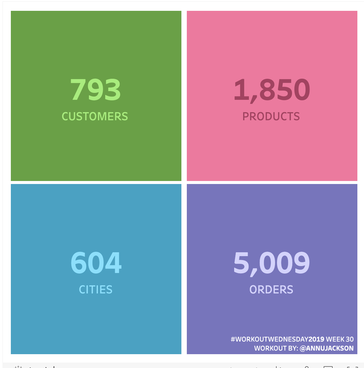
- Dashboard size: 600 x 600, # of sheets is up to you
- Create a 4 block of KPI/BANs representing the distinct count of
- Customers
- Cities + State combo
- Product Name
- Order IDs
- Users should be able to click on a box and navigate to a bar chart that shows Sales by the chosen dimension
- Match formatting (and I’ve turned off all tooltips this week!)
- Colors come from Hue Circle
Here’s my viz –
Follow me on twitter @viraj155 to share and get updates on my weekly viz’s.
